Yield Curves in Dash
Web app using Dash, Plotly, and Treasury data to get a historical and current look at yield curves and spreads.
With a lot of recent focus on the direction of US interest rates and the likelihood of a recession, I thought I would play around with Treasury yield data to construct an easy way to keep an eye on how yield curves are changing. For those unfamiliar, yield curves are simple plots of the yield of a Treasury bill, note, or bond versus the maturities of the securities. The Treasury publishes the market yield for each maturity daily.
Using Dash and Plotly, I created a simple tool to pull in the daily yield data and create some metrics. Feel free to clone from github here. Below I’ll explain how to use and interpret the metrics displayed.
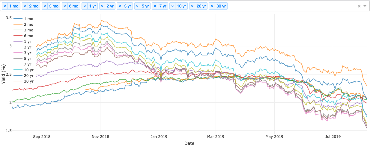
Historical Yields
The first chart simply shows the historical path for yields for each Treasury maturity. Lately while shorter term maturities (say < 1 year) have been relatively flat, longer term maturities have sharply declining yields. The Federal Reserve has more direct control over short-term maturities by setting the target range for the Fed Funds rate and providing guidance through commentary and dot plots. Longer term yields are a reflection of the market’s expectation of future interest rates. As economic data has weakened and the Fed has turned from raising rates to a potential easing cycle, longer term Treasury yields have declined.
Yield Spreads
Yield spreads are one place to look when discussions of an yield curve inversions are omnipresent. An inversion occurs when a shorter term Treasury becomes higher yielding than a longer term maturity. What maturity pair determines when the curve is officially inverted? Market participants do not fully agree on this question, so the chart below shows the spreads between yields of three different maturity pairs: 10 years / 2 years, 10 years / 6 months, and 5 years / 2 years. When the spread is below zero, the longer maturity Treasury has a lower yield than the shorter one, meaning that yield spread in inverted. So far the 10yr-2yr spread has not inverted, while the other two have bounced in and out of inversion.
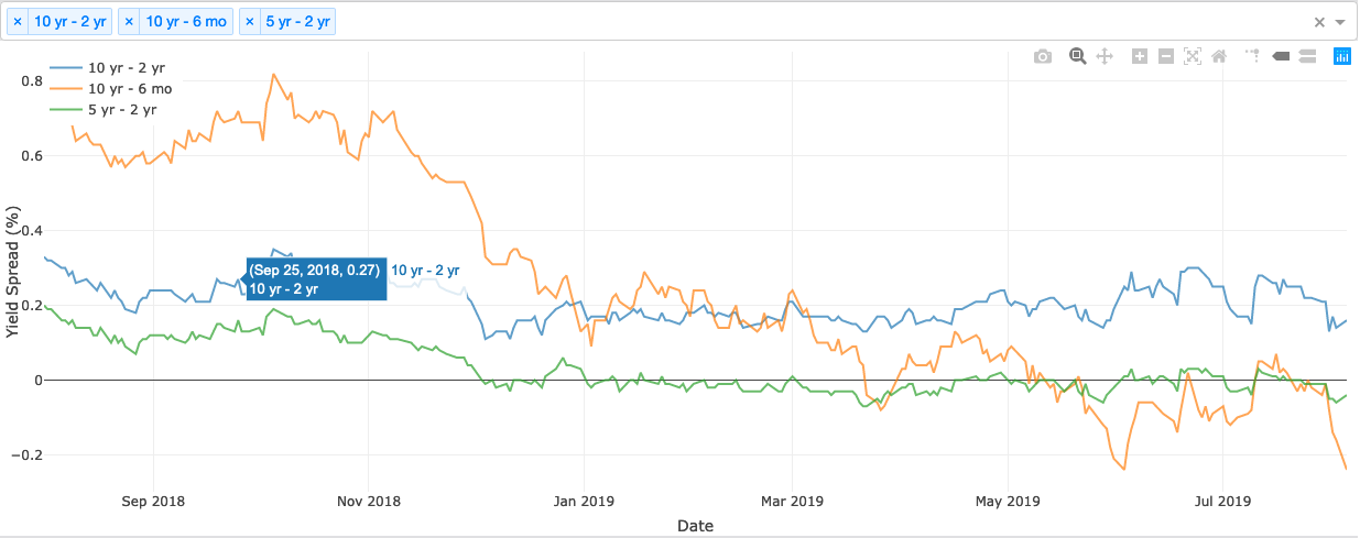
Typically, one might expect long term Treasuries to yield more than shorter term due to a term premium and the expected path of future interest rates. When investors expect the economy to continue to grow steadily, eventually they would expect the Fed to increase interest rates to cool the economy before it overheats. Additionally, investors carry duration risk with longer-term treasuries since they do not know the future path of rates, which typically would command some premium in the yield of an asset. When the yield curve inverts, the market is sending some of these potential signals: - The market expects future interest rates to be below current interest rates due to an economic contraction. The Fed will cut rates in response to deflationary pressures or increasing unemployment, making future interest rates lower than current interest rates. - A coming recession will send investors running from risk assets. Treasuries are the most popular risk-free asset around, so investors will pay more for longer-term Treasuries as a way to protect their principal. More demand pushes up the price of those Treasuries, decreasing their yields.
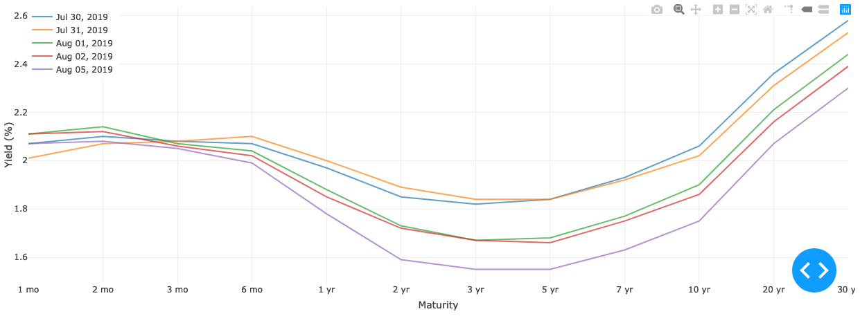
Yield Curves
Finally, the dashboard has a graph of yield curves - every maturity plotted against their yields on a specific date. By plotting the trailing 5 days, we can see how the shape of the yield curve has changed from the recent past. Trade tensions and the recent reduction in the target Fed Funds has sent yields plunging in the last week.
Feel free to reach out with comments, questions, or suggestions.